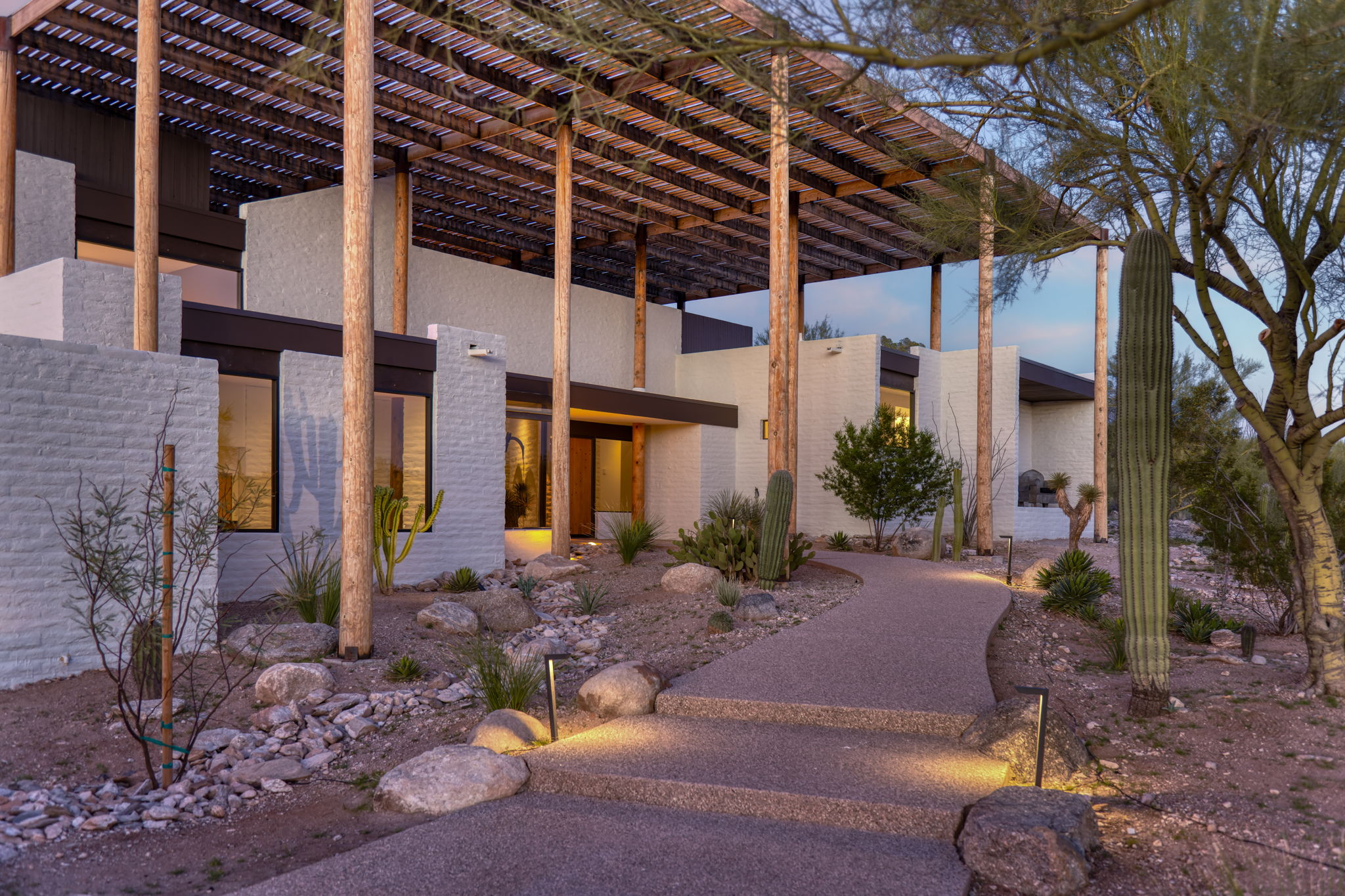
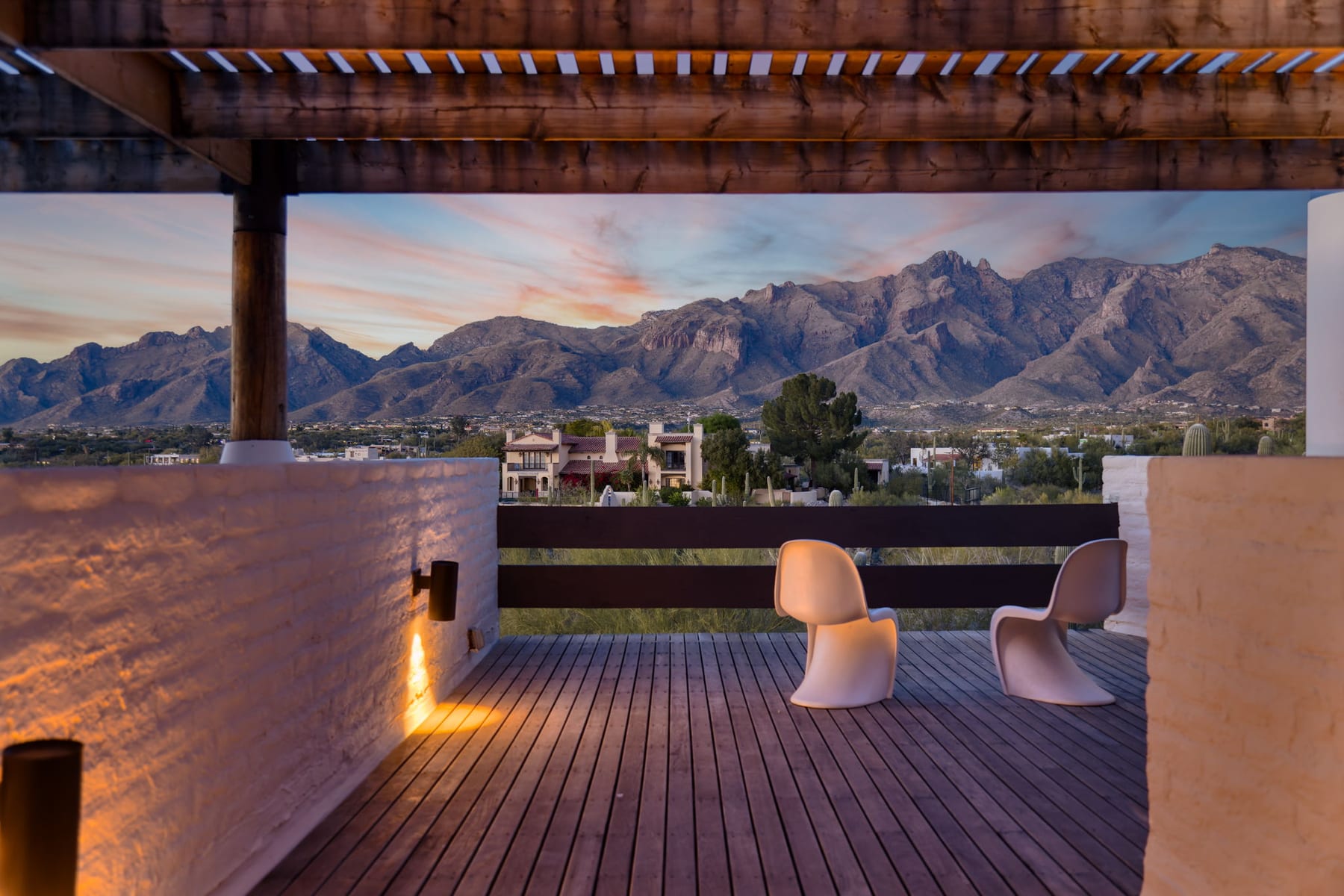
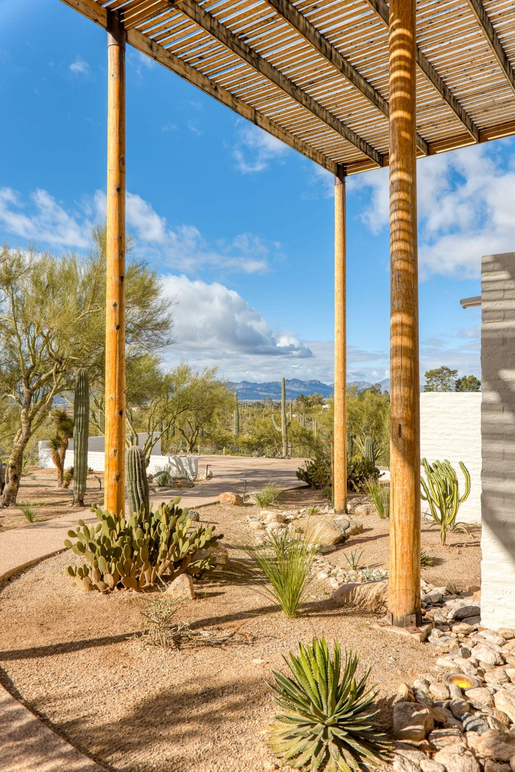
There is a house in the Catalina Foothills that almost insists you think about composition. The Ramada House, designed by Judith Chafee in 1973 and completed in 1975, is a two-story masonry block residence sitting under a separate, self-supported lattice of wood — the ramada itself, twenty round posts and a grid of closely-spaced timbers, inspired by traditional Tohono O’odham shade structures. Chafee was operating in what architectural historians later called critical regionalism: modernist discipline answering to specific climate, landscape, and culture. The house was added to the National Register of Historic Places in 2006.
It’s the kind of building where the architect did much of the photographer’s work in advance. The grid is already there. The rhythms are already there. The framing devices — the columns, the slats, the windows looking through to courtyards looking through to mountains — are already there. The job is to find the angles that honor what the architect built.
A house like this is also a useful place to think out loud about composition, which is what this piece is. Most of what follows applies to any building. But the Ramada House makes the lessons unusually visible.
There’s a question I’ve been asked more times than I can count, and almost always by clients standing next to me on a shoot, looking at the back of my camera: “Why is that one so much better than the others?”
The honest answer is that the brain decided before the conscious mind did. By the time someone’s eye has landed on a photograph and the word good has formed in their head, a sequence of unconscious processes has already run. Composition isn’t a feeling. It’s a pattern of decisions — most of them old, some of them mathematical, and almost none of them random.
After over twenty years behind a camera, I’ve stopped thinking of composition as an art and started thinking of it as an answer to a specific question: what is the human eye actually doing when it looks at a photograph? The work gets easier when you know.
The eye is lazy. The brain is hungry.
The first thing worth knowing is that the human visual system is built for survival, not for art appreciation. The eye is constantly scanning for two things: threats and patterns. When the brain detects a clean pattern — symmetry, repetition, geometric order — it registers a small dose of pleasure. The pattern means no surprise here, you're safe. When the brain detects asymmetry, it registers tension. The tension says something here doesn't resolve, look closer.
A great photograph uses both. Pure symmetry is satisfying but dull. Pure asymmetry is dynamic but exhausting. The sweet spot — the place where most working photographers spend their careers — is asymmetry within an underlying order. The frame feels balanced, but the eye finds something specific to land on.
This is the actual mechanism underneath the rule of thirds, the golden ratio, leading lines, and every other compositional rule you've ever heard. They're not rules. They're descriptions of what the brain is already doing.
When the architecture is already a grid.
Some buildings hand you their composition before you arrive. The Ramada House is one of them. The lattice canopy is built on a strict structural grid — round posts at regular intervals, horizontal beams at right angles, a closely-spaced lattice of timbers above. Stand under it and look up and you are looking at a working compositional study: repetition, rhythm, controlled negative space, light filtered through pattern.
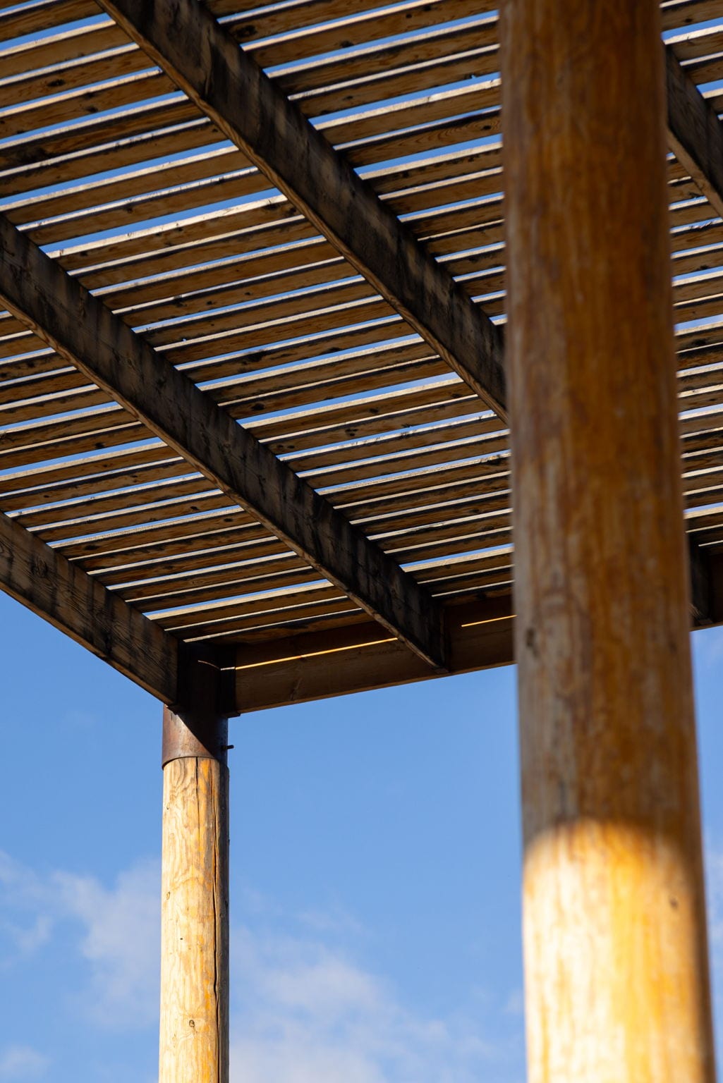
When a building is doing this kind of compositional work on its own, the photographer’s job changes. You stop looking for novel angles and start looking for the angle that lets the architecture’s own discipline come through cleanly. Most of the work is subtractive: which posts crop where, where the lattice meets the edge of the frame, what depth of field allows the rhythm to read without distortion.
Critical regionalism — the framework Chafee’s work is often discussed under — is partly the idea that modernist discipline gains specificity when it answers to local conditions. The same is true of architectural photography. A frame becomes serious when it answers to what the building is specifically doing, instead of imposing a generic compositional template on it.
Why your subject doesn't belong in the center.
A subject placed dead-center is the visual equivalent of someone walking up to you and immediately telling you the punchline. The eye registers it, files it, and moves on. There's nowhere left to look.
A subject placed off-center — at one of the rule-of-thirds intersections, or on the golden spiral — gives the eye a place to land and somewhere to look next. The frame becomes a small journey: enter here, rest there, find the secondary element, return to the subject. That motion is what makes a photograph feel alive instead of static.
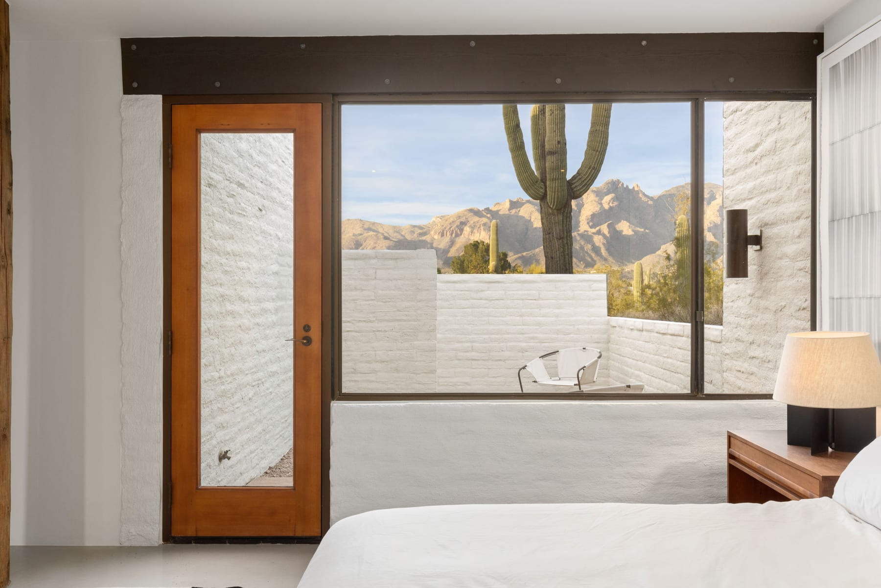
There are exceptions. A perfectly symmetrical building shot dead-on its central axis can be powerful — but only if the symmetry is the subject. That’s what’s being communicated: the discipline of the architecture itself, expressed by the frame. The composition is doing exactly what the building is doing. When that happens, the rule of thirds doesn’t apply because the photograph is making a different argument.
The Ramada House is a study in this tension. Some frames demand the central axis — the canopy’s grid won’t tolerate being broken. Other frames demand thirds — the layered views through doorways and courtyards refuse to sit still in a centered composition. The building tells you which kind of frame each room of it deserves. The photographer’s job is to listen.
Leading lines are not lines. They're suggestions.
The phrase leading lines is taught in every photography class and is mostly misunderstood. A leading line isn't a literal line in the frame. It's any visual element that creates directional movement across the image — a road, a roof edge, a gradient of light, a sequence of windows, the curve of a desert ridge.
The brain reads these elements as paths. The eye follows them, the same way you'd follow a trail in the woods. If the path leads to the subject, the photograph feels resolved. If the path leads off the edge of the frame, the eye follows it out and the photograph empties. That's why leading lines matter — they're the choreography of where the viewer's attention goes.
Most architectural photographs have multiple leading lines competing for attention. The art is in deciding which line gets to lead. The hierarchy of which path runs first is often what separates a frame that works from one that doesn't.
Visual weight is what you actually balance.
Photographers talk about balance like it's about geometry. It isn't. It's about weight — and weight is psychological, not spatial.
A small bright object on the right side of a frame can balance a large dark object on the left, even though the spatial geometry is asymmetric. The brain assigns more weight to:
- Bright areas over dark
- Warm tones over cool
- Sharp focus over blurred
- Faces over objects (always — humans are wired to find faces)
- Saturated color over muted
- Motion or implied motion over stillness
A working photographer carries this calculus around the way a musician carries scales. You don't think about it consciously by year ten — you just know when a frame feels off on the right side and you adjust until it doesn't.
Negative space is part of the photograph.
The empty parts of a frame are not unused real estate. They're a deliberate compositional element. A photograph with too much subject in it overwhelms the eye; the brain can't decide what to look at, so it looks at nothing. A photograph with generous negative space gives the subject room to breathe — and the eye somewhere to rest.
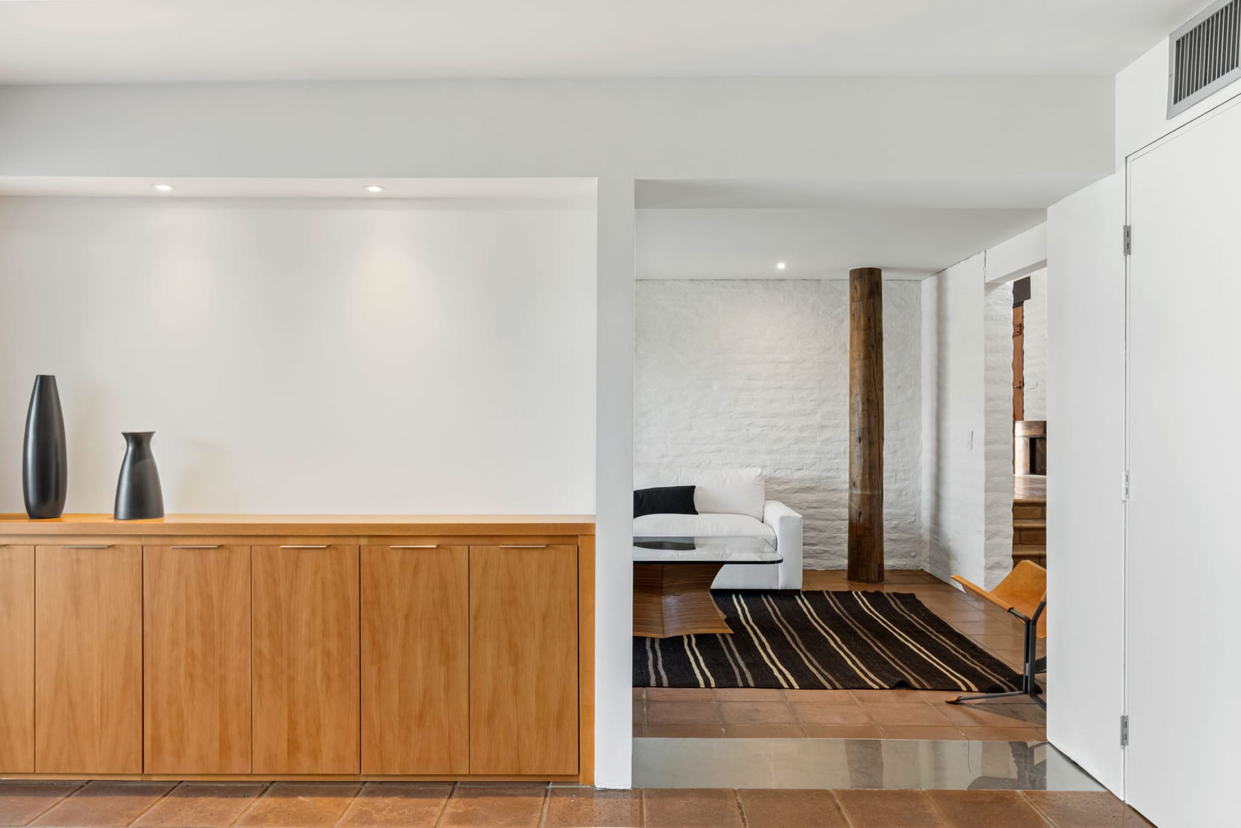
This is especially true in architectural work. The buildings we document are objects in space. The space around them is part of the architecture. A great frame includes both — the building, and the air it sits in.
The Ramada House is, in a sense, an essay on negative space made of building materials. The lattice canopy isn’t a roof; it’s a controlled subtraction of sky. The columns aren’t walls; they’re the minimum structure required to hold up the subtraction. What you photograph, when you photograph this house well, is the relationship between what’s built and what’s deliberately left empty. The composition is mostly the empty part.
When a photograph feels claustrophobic, it's almost always because there isn't enough negative space. When a photograph feels powerful, the negative space is doing a third of the work.
The same eye, in moving image.
Everything above applies to film too. The eye that scans a still photograph for pattern and tension is the same eye that scans a film frame for the same things — only now it has to keep doing it, twenty-four times a second, for the duration of the take. Composition in cinematography isn’t a different discipline from composition in stills. It’s stills with the added problem that the frame is moving and the light is changing while the camera holds it.
A photograph captures a single composition. A film commits to a sequence of compositions, each one earning its place. The cinematographer chooses the angle, sets the frame, and lets the building act inside it. When the work is good, every paused moment of the film could stand on its own as a still — and every still feels like it belongs in a longer sequence.
Most of our serious work is commissioned for both deliverables — photography and film, scheduled together, planned around the same windows of light. The two disciplines feed each other. The Ramada House was a project where that overlap became unusually visible, because the architecture itself is built on a grid and the camera, still or moving, finds the grid wherever it points.
So why does any of this matter to you?
Here's the practical version. The next time you're looking at architectural photography of your own project — whether it's listing photos, a portfolio piece, or a feature in a magazine — try this:
Notice where your eye lands first. Notice where it goes next. Notice whether it leaves the frame or stays inside. Notice whether the subject of the photograph is the building or whether the photograph itself is reaching for attention.
The best architectural photography disappears in service of the work. The subject is the building. The photograph is the medium. The viewer's eye should rest on the architecture, not on the photographer's choices.
When that happens — when composition is invisible because it's working — you've found something rare. That's the photograph that ends up in the magazine, on the firm's portfolio, in the architect's monograph thirty years later. Not because anyone said it was good. But because the human visual system, given a quiet image with no friction in its way, has nowhere else to land.
The eye stops where it's allowed to.